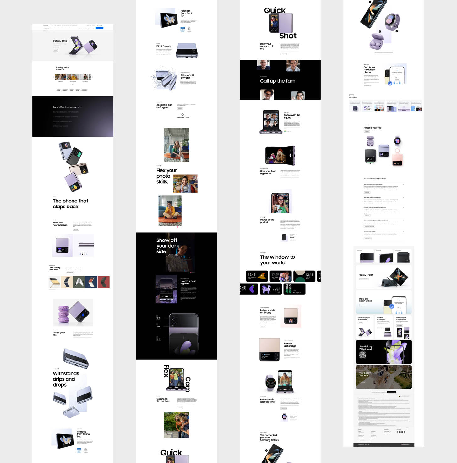
Over the past 4 years I helped launch every Samsung mobile product, from foldable phones and smartwatches to tablets and laptops. During this time I also helped redesign the home page, create a new compare experience, promote the newly opened experience stores, and make all the numerous changes that happened during the first months of the pandemic.
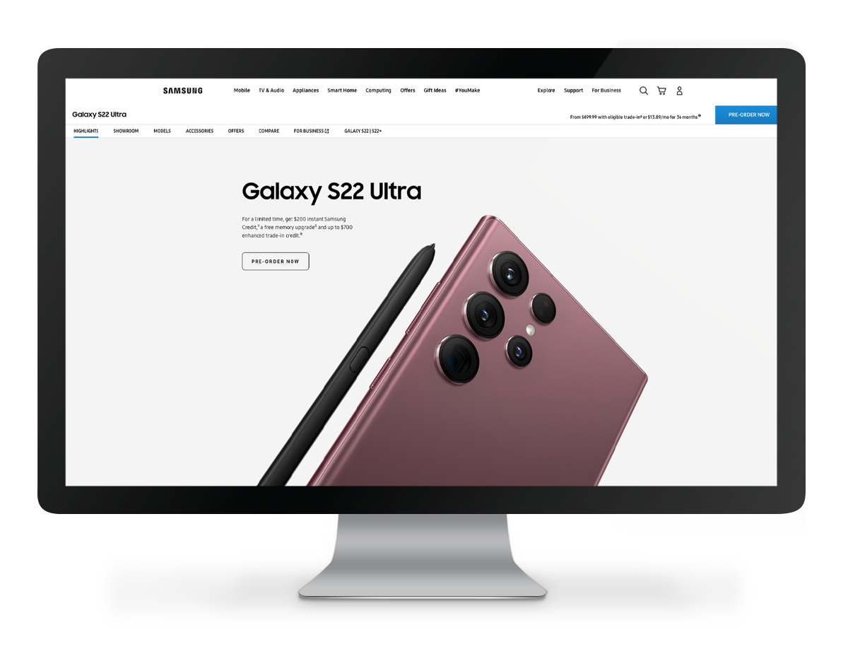
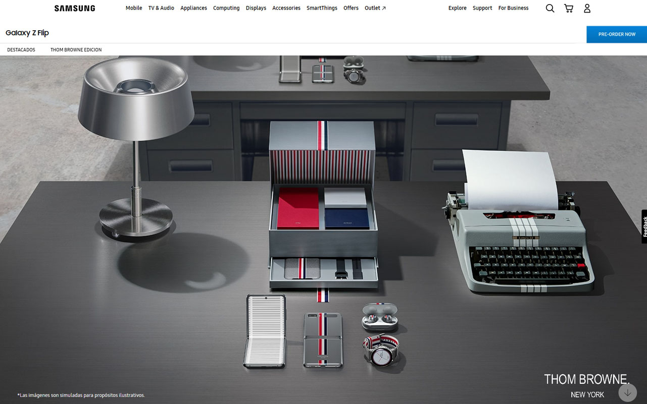
Big releases would typically have very long pages, sometimes more than 30 thousand pixels in height, making them impractical to show here. The following is an example of one page, localized from the originals provided by Samsung HQ.
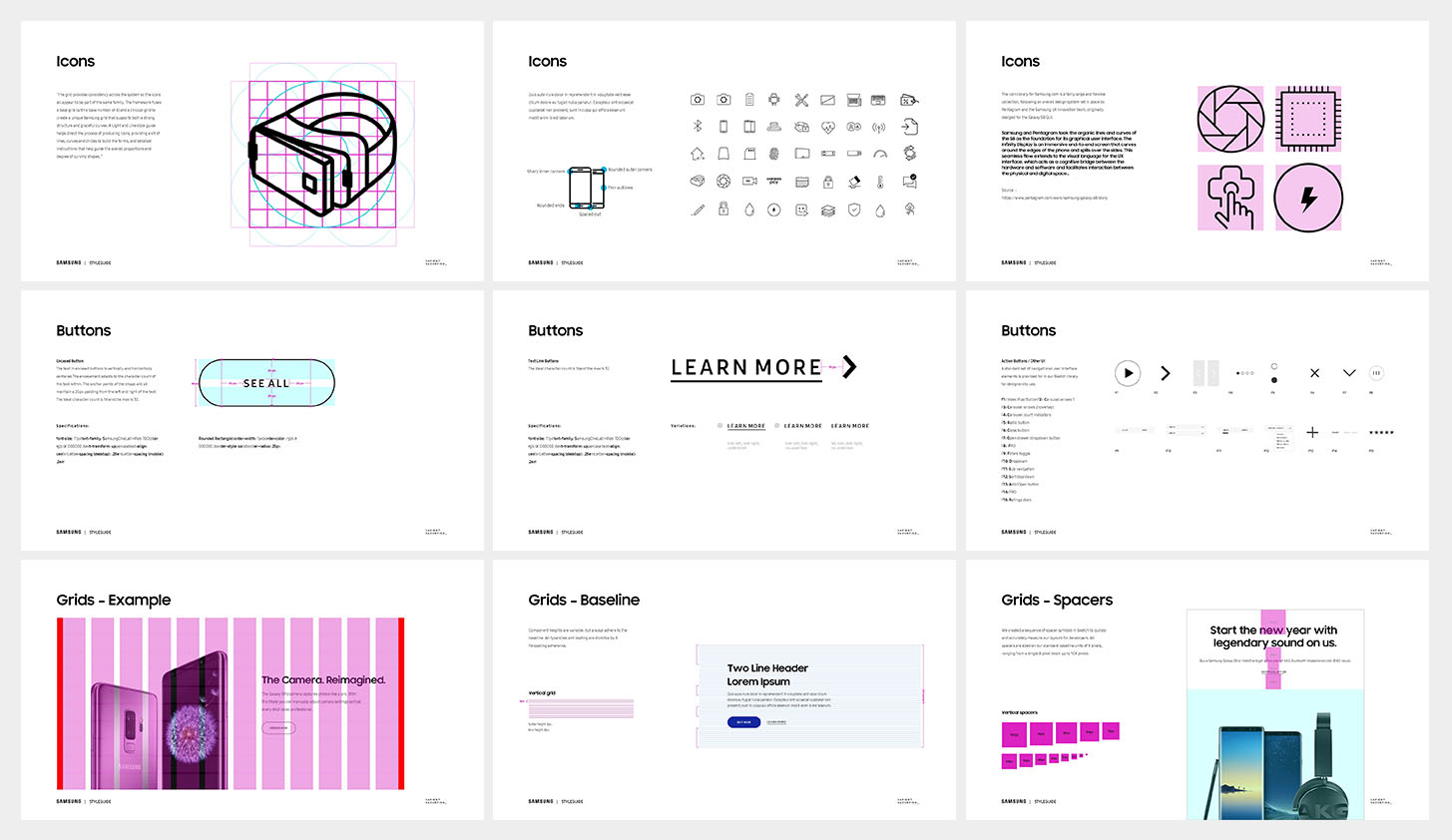
The Sasmung design style guide was an internal document geared towards junior designers, strategy and other production teams. It covered all the good and bad practices, served as a general stylistic guide on page layout, photography styles, creation of new icons, preparation and handoff to development teams.
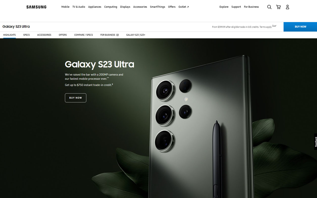
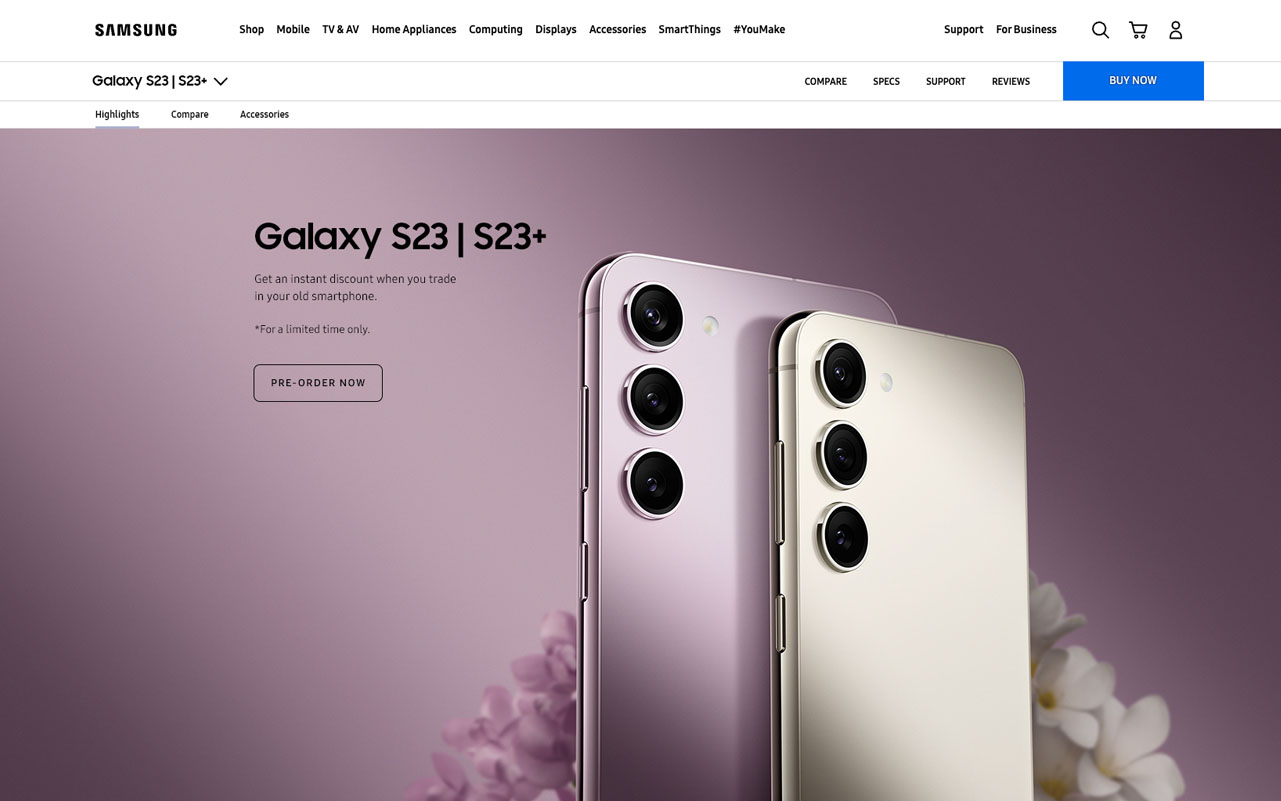
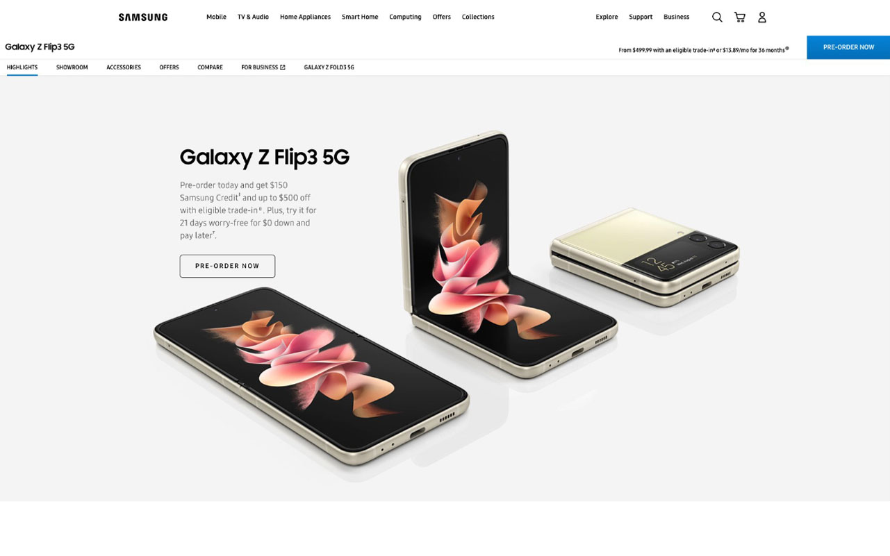
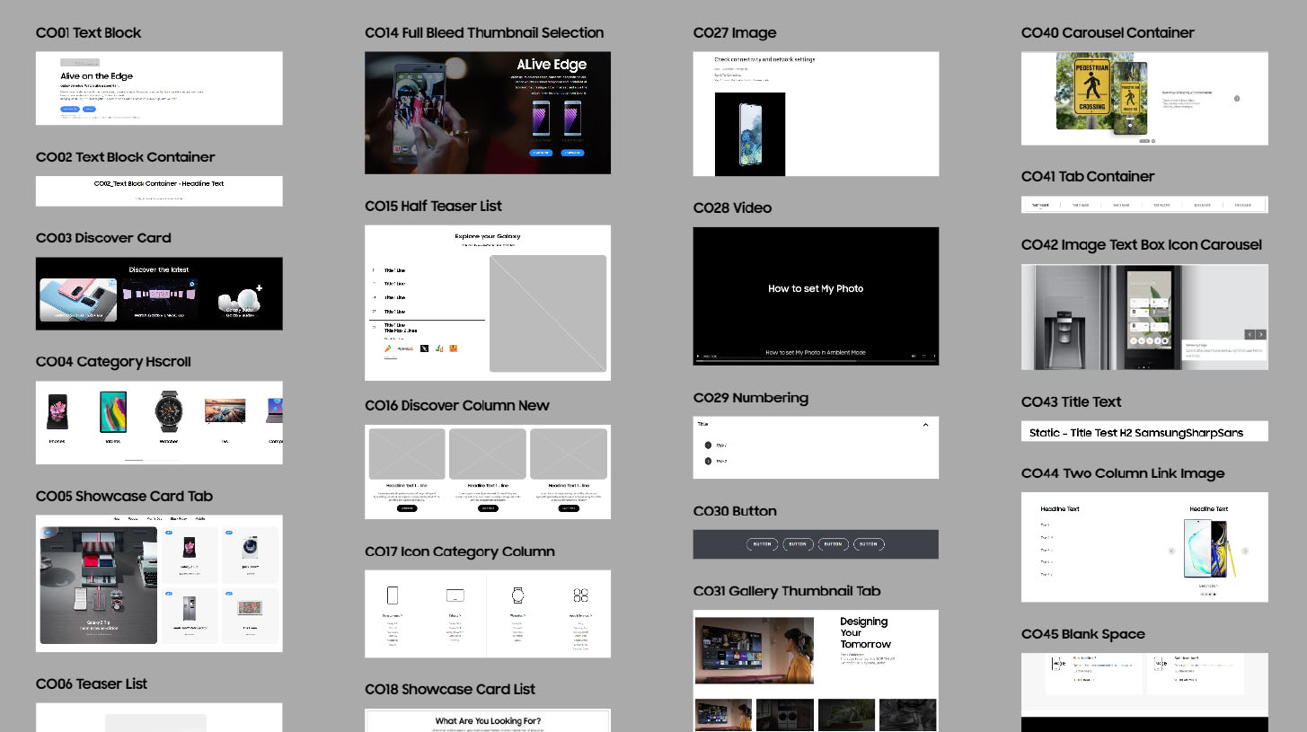
Samsung uses four distinct component systems, depending on the site section and the purpose of the page. The systems are mutually incompatible, have their advantages and limitations, and require a lot of familiarity to put them to good use. During my time, it was a mutual effort between visual designers and the UX team to develop them into a comprehensive state, create component libraries and templates, and work with Samsung's internal development team to iron out each component’s stylistic and functional nuance.
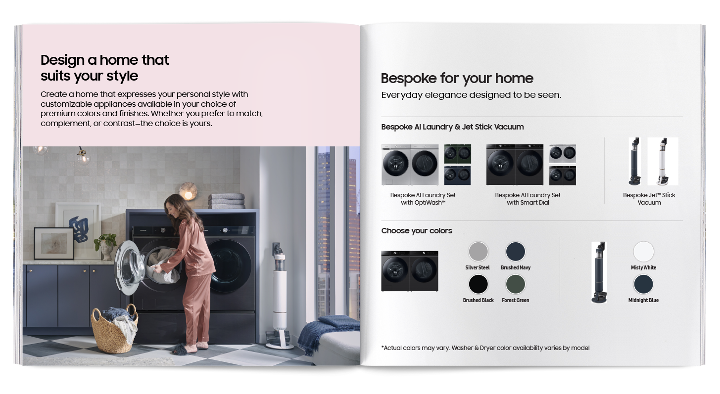
This is a small printed brochure prepared for Samsung's Bespoke catalog, the series of gas ovens and refrigerators with customizable colors.